新年伊始,没想到,我又决定回来更新了。这是我之前就想好的题目,今天终于动笔——Hexo博客的深度个性化。(不瞒着你们,我一向这样,更一段时间,鸽一段时间。也许看着这学期我周更,但那些都是一些感想,并不是特别花时间的技术博)
这里会讲一讲:
back2top按钮百分比的动画还有进度条颜色相关文章推荐模块中的
CSS统一给个别文章添加
Creative Commons许可证开关主页文章节选悬浮特效
1. 关于阅读百分比
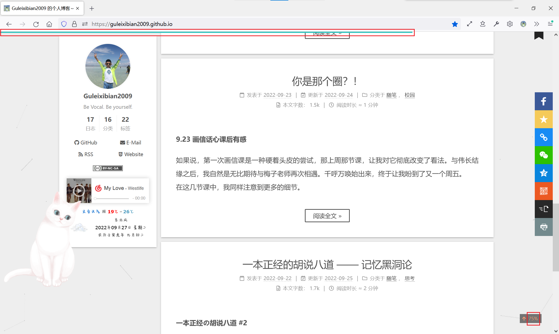
可以看到我这个博客之前既启用了顶部进度条和back2top里的百分比,我个人觉得有点重复,想要把百分比数字只在鼠标悬浮时显示,并且给它加个动画。进度条的颜色光绿色也有点单调,我想加一个蓝-绿色渐变。这个都是可以通过CSS实现的,在Hexo中则是stylus。
在Hexo中想要改CSS的话,先别急着去新建文件,最好先在themes/next/source/css这个文件夹里面找一找,阅读百分比的两个文件在_common/components文件夹里。
1.1 阅读百分比动画
要实现这个我首先的思路就是给width加transition,再配合overflow: hidden来实现;不过为了如此我们要给这个元素加一点额外的属性。
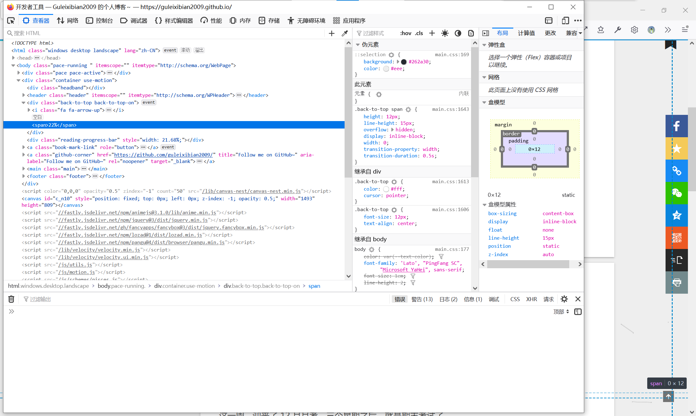
这个百分比是div#back-to-top里面的一个span,对应的stylus是back-to-top.styl。
1 | .back-to-top { |
这里有两个注意点:
transition要求width必须是定值,不能是auto,故我们要手动去加一个width和padding,以保证美观。能应用
width属性说明这个<span>的display至少要是inline-block,不能是inline。
综合我一开始的想法并结合这两个要点,这里给出最终代码:
1 | .back-to-top { |
1.2 阅读进度条渐变色
在我们的主题配置文件中,这一块是用来配置进度条的。

1 | # Reading progress bar |
这个color属性就是用来调颜色的。然而如果是渐变的话,就一定要用linear-gradient(),对应的CSS属性则是background-image。以防万一,我去看了一下themes/next/source/css/_common/components/reading-progress.styl,里面对应一行是:
1 | background: unquote(hexo-config('reading_progress.color')) |
它用的是通用的background,这样就万无一失了。我们直接把color改成:
1 | color: "linear-gradient(to right, #2299dd , #37c6c0)" |
并重新生成即可。
2. 相关文章推荐中的CSS统一
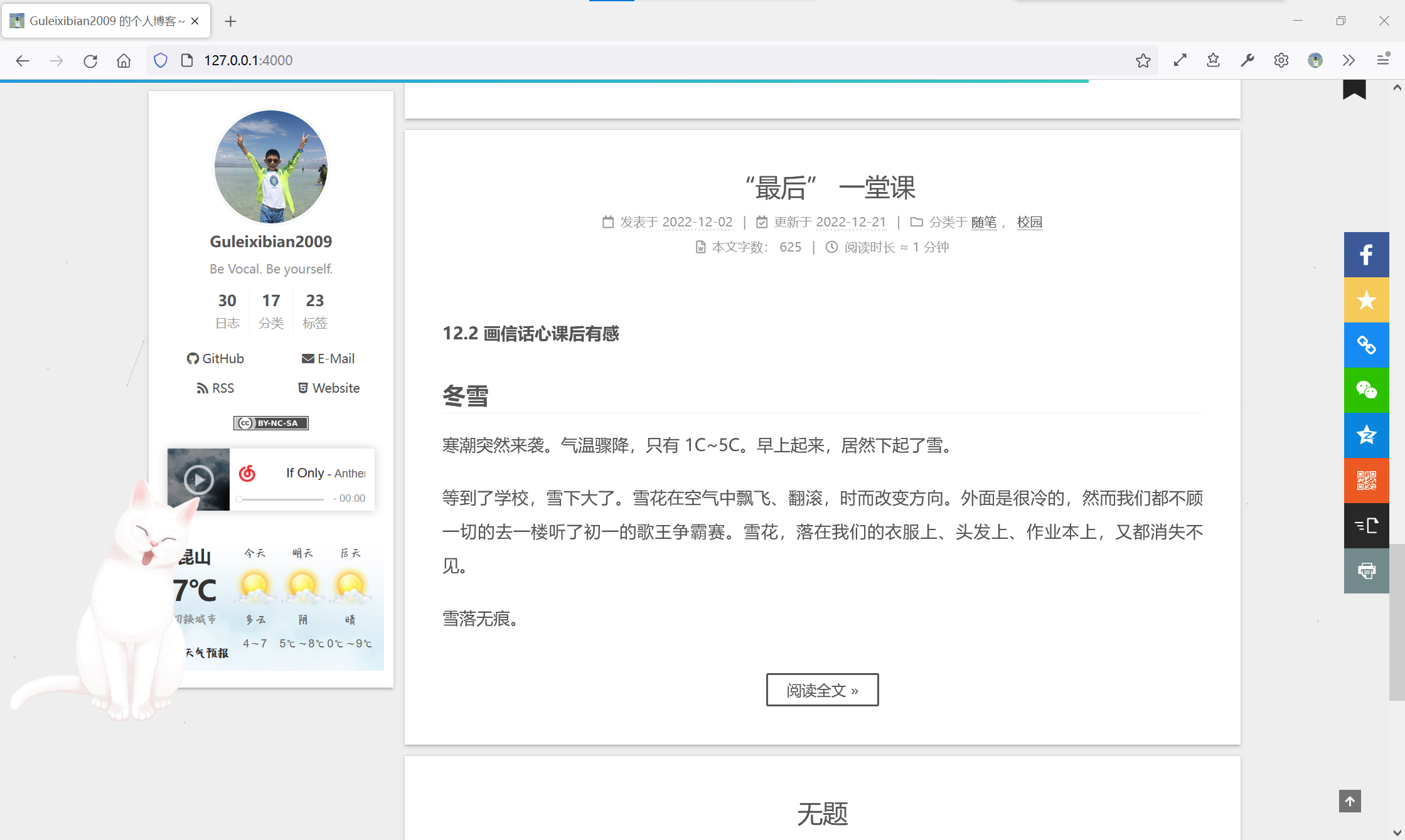
如果你像我之前一样,安装了相关文章推荐模块,却不对其进行任何调整,你会收获这样的文章推荐:
字号、行距不统一,粗体、斜体没消除,甚至还有图片,根本不像一份合格的文章节选。原因在于,这个相关文章模块和文章主体共用CSS。我们要做的,就是用!important覆盖掉。
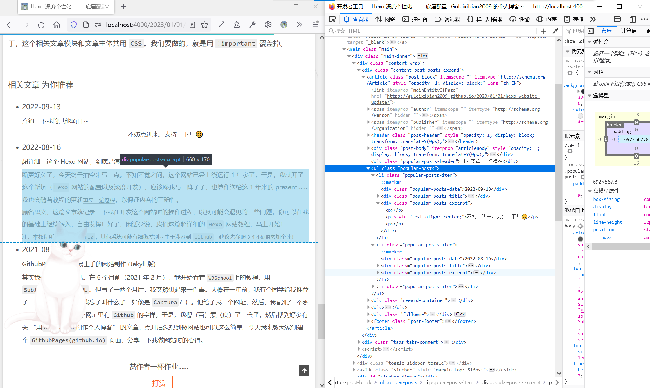
这个节选是div.popular-posts-excerpt,默认继承main.css中的样式。找一下对应的stylus文件,是themes/next/source/css/_common/components/third-party/related-posts.styl。我们直接在末尾添加一段
1 | .popular-posts-excerpt{ |
就可以规避掉大部分问题。后续如果发现更多需要屏蔽或调整的,也直接加在这里就好了。
3. 给文章内Creative Commons加个开关
在技术博中,转载和引用是常有的事。然而Next自带的版权方框就是这么尴尬,默认是串联起来的,只能在主题配置文件中选择全开或全关。全开时,不是你写的硬要说成你写的,心里总是不安。
不过,有一种办法是类似之前我们有一个文章开头yml里配置的属性,叫做sticky。我们可以做一个类似的开关,比如叫nocopyright,true代表转载,不会显示版权方框;false或不写,则会显示。于是乎我们去看一下版权方框的生成逻辑,在themes/next/layout/_macro里的post.swig里面,大约在225行:
1 | {%- if theme.creative_commons.license and theme.creative_commons.post %} |
这是Nunjucks中的一个简单的条件语句,我们只要添加一个条件and not page.nocopyright就可以了。page指的是当前渲染的文章。所以就是这样:
1 | {%- if theme.creative_commons.license and theme.creative_commons.post and not page.nocopyright %} |
然后找到你不想显示版权方框的文章,在开头的YAML Front Matter里面加一行:
1 | nocopyright: true |
即可。需要显示则不需要加,默认显示。
4. 主页文章悬浮特效
这个的话,我主要是想做一个缩放+透明度的transition,应用在主页的article.post-block上面。不过我特意去检查了一下,在文章页也有这样的元素,但我只希望对主页应用,所以我找到一个父类index(文章内则是post)。
这个就是简单的CSS了,随便找一段styl插进去,我就加在了themes/next/source/css/_common/components/post/post-expand.styl里面了:
1 | .index { |
这样就能实现缩放+透明度的特效了。
总的来说,Hexo+Next留给个人的发挥空间还是非常大的,底层逻辑完全开放且容易修改,因此个性化变得非常简单,只需要一点点CSS的知识就能让你的博客锦上添花!
THE END感谢您的阅读~